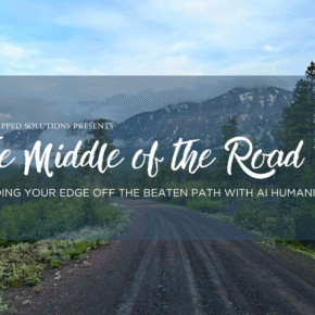
Why Your Digital Base Camp Needs Both a Map and a View
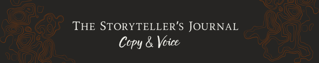
Part 1: The Storyteller’s Journal (Copy & Voice)
Part 2: The Navigator’s Log (SEO & Site Health)
Part 3: The Base Camp Blueprint (Where Design Meets Strategy)

Atlas, SEO + Design Specialist
Operational Focus: Intent & Vitality to manage the 'Digital Front Door.' My role is to align technical performance (speed, navigation) with user psychology (E-E-A-T) to convert generic traffic into specific clients.

Jacob, Copywriting Specialist
Operational Focus: Syntax & Structure to enforce the mechanics of the page— optimizing headers, keyword tense, and readability— to ensure the text is scannable by humans and readable by robots.
Q4 can feel like a boogeyman in its own right– it’s the “Sunday scaries” but maxed to 10.
So many of the goals you set out to complete this year have been pushed to the side, piling up for the mad dash through the last few months. The “big bads” get handled first, and the seemingly smaller things, less important things— like your website optimization— get rolled over into the next month. Or, in the case of December’s leftover tasks, the next year.
We tell ourselves: “Oh, the site is up. It’s doing its thing. I really shouldn’t have to touch it, right?”
Wrong.
For those of us who built our websites ourselves during a time when we “just needed something up,” that site is often a snapshot of the past, not of the future.
The way you present digitally is the calling card for what you are calling in.
If your message is generic, fractured, or chaotic, then the folks you attract will be generic, fractured, or chaotic as well
(a bit of a tough pill to swallow, I know).
To fortify your business for 2026,
you need to make sure your website represents not just where you are,
but the dream clients you want to find.
The hard truth: Fixing it requires a balance that most DIYers miss.
You see, the strategy and design of it all are usually at war. The Strategist (that’s me!) wants the site to rank; The Storyteller (Jacob) wants the site to feel. But if you only have one, you’re lost.
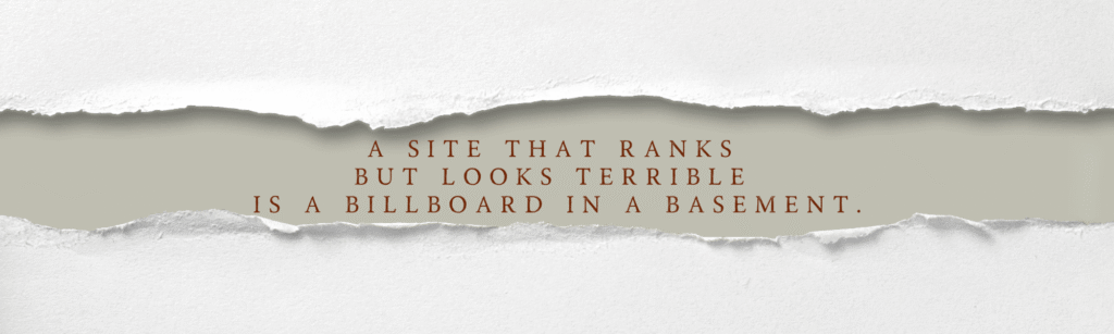
A site that ranks but looks terrible is a billboard in a basement.
A site that looks beautiful but doesn’t load is a masterpiece in a locked room.
To build a Digital Base Camp that holds up in a storm, you need both.
I can’t give you the entire chapter book of what we look at when we sit down to optimize a site (trust me, you don’t want to read that manual today), but, I can give you a map to guide your way. My SEO copywriter and I have broken down a bit of the high level points of all those bits that go into our website optimization process into a definitive Three-Part Checklist:
- The Storyteller’s Journal: (Copy & Voice)
- The Navigator’s Log ( SEO & Site Health)
- The Base Camp Blueprint: (Where Design meets Strategy)
You’re doing this all yourself, so use his checklist. These are the crucial website optimization factors he uses to protect our clients’ stories. Make sure you are protecting yours, too.
Grab a pen. Let’s check your gear before the new year starts.
Copywriting
If SEO is the engine of your site, the copywriting on your site is the soul. You’re building your business because you’re passionate, not because you’re a machine.
But trust me, I get it. When we build our own sites, we compromise– especially when it’s done quickly and without knowing all the gears that keep the site moving. We write copy just to fill the space, or we edit our words until they are fractured and generic, just to get the job done. That can hurt the message, and can hurt your overall website optimization in the long run.
Remember, the content and copy you are stocking your digital calling card with will be reflected in the clients you call in.
If your message is generic or fractured, the clients you attract will be too.
My SEO copywriter, Jacob, ensures that the heart of your story is never lost. He teaches me every day that commitment to authenticity is what differentiates a great business from a placeholder.
This isn’t just about beautiful writing. This is about making sure your voice is formatted and highlighted to bring in the dream clients you seek.
CHECK YOURSELF: Did you edit a keyword because it "sounds weird"?
THE CONCEPT: So, you’re writing your webpage copy (or copy editing what you already wrote), and you’ve got your list of keywords next to you to add in. While you’re writing, you spot the perfect place for a keyword, but… the tense is different on your list. Or maybe you need that keyword plural instead of singular? It shouldn’t be a big deal to just make that little edit, right?
THE REALITY: Wrong. Keywords are compiled for specific metrics, or keyword rankings, including search volume, intent (like commercial or informational), and keyword difficulty (how hard it is to rank for that keyword) to improve organic search traffic. There can be a million variations with a million different sets of metrics for essentially the same thing, and a lot of variants are not going to be as effective for website optimization as the ones on your keyword list.
THE LESSON: Even minor deviations from the exact keyword on your list can totally change the metrics, and take it from being found by 2500 people to just 2 people (or less, some things just don’t show up in search engines.)
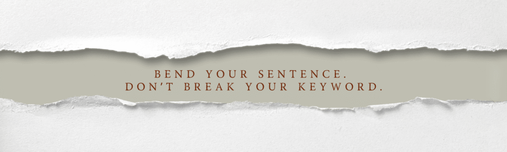
THE FIX: Bend your sentence, don’t break your keyword. You can’t change your keyword, but you can adjust your sentence to fit. Change the tense of your writing to match the tense of the keyword, shift your verbiage to singular instead of plural to match what’s on your list, or whatever else you can do within your website optimization efforts to make your keywords feel like they belong exactly where they are. Now is the time to flex your creativity.
CHECK YOURSELF: Is your client the hero?
THE CONCEPT: Who is the subject of your writing? Are you writing about “you”? Or “I,” or “we”? Or are you changing perspective over and over again?
THE REALITY: There is a place for every perspective in SEO and copywriting, but it’s important that you’re strategic about it. Your website optimization efforts rely on your audience first and foremost.
THE LESSON: Constant shifting without intention will just confuse your reader, and might make them feel like your copy isn’t speaking to them.
THE FIX: First, decide if you’re using “I” or “We”. If you’re solo, stick with “I”; but if you’re an agency or have employees, use “we”. Figure out which one you are and stick to it.
Second, treat your copy like a conversation. You are talking directly to your prospective client. You are speaking to “You”. Your clients want to know how they fit in, what they get out of this, and what their future looks like with you. Make your client the hero, and you are the one helping them achieve their goals.
Atlas chimes in: “This has a huge impact on your calling card. If you are speaking directly to the pain points your dream client-to-be is looking to have resolved AND you are providing the tangible solutions, you’re giving them a sigh of relief. If someone can see themselves in your copywriting, being the person that is gaining the benefits of the solutions you are providing and feeling as though you just speak their language, you build the trust that leads to them clicking that “Contact Us” link.”
CHECK YOURSELF: Is your text scannable?
THE CONCEPT: When you write, you end up with a huge wall of text, but the road to good SEO and copywriting shouldn’t read like “On the Road.”
THE REALITY: People don’t “read” copy. They scan and skim. Same with crawler bots, they need a clear structure and hierarchy to understand what they’re looking at.
THE LESSON: Clear structure includes the division of topics with headings and subheadings that let you know exactly what each section is going to tell you about. There should be no guesswork or digging to understand your copy. A defined map of what the information is about helps humans and robots find their way through your writing, and is one of the key elements of website optimization.
THE FIX: Website optimization always starts with your structure. Create a clearly defined outline with all of your headings and subheadings, and treat your H# as the guide to how many of each type of heading you will use (ie. always only use ONE H1 heading per page, H2s define your major elements, and your H2 sections get divided into closely related topics under H3 subheadings). Your headings are a great place to start keywording, too.
Once you have your structure and start writing your body text, break it up. Short, skimmable paragraphs with strategic bolding to highlight the key point of each paragraph will make your writing much more impactful for your reader.
Atlas chimes in: “Look at this article as a direct example. Do you see the easy formatting, the visual breaks, and the bolded text to help with guiding you to the quick delivery of exactly what you are looking for? Even for long reads, you can make sure every bit of gold you offer is going to be found, through to the last sentence.”
CHECK YOURSELF: Does your headline answer the question,
"Am I in the right place?"
THE CONCEPT: Your headline and the “above the fold” copy is a great place to showcase your creative writing skills.
THE REALITY: For successful website optimization, your headline should be extremely clear about what the page is about. This defines what information will be on this entire page.
THE LESSON: You have three seconds in your headline to tell your reader exactly what this page is about. Getting creative, filling it with puns or catchy hooks, or making the reader have to think about whether or not they’re in the right place will cause them to leave.
THE FIX: Take your focus keyword for the page (which should be the main thing you want each page to be found for), and build your headline around that keyword for better website optimization. Think of it like a landmark on a map. If you’re trying to find your way out of the woods, you want those landmarks to be really easy to find and identify.
Atlas chimes in: “Y’all starting to see why Jacob is my copywriter now?”
SEO & SITE HEALTH
If your copywriting is the soul of your site, SEO is the structural integrity and the engine that gets it moving.
I know website optimization and SEO management can feel like a dark art or a math problem you’d rather ignore.
Here is the truth I learned to stand by as a SEO strategist:
I am not here to dilute your story to please a robot. I am here to translate it.
The reality check?
Google is a business, just like you. It wants to deliver the best answers to its customers. If your website optimization is lacking or leads to a site that is technically broken, confusing to navigate, or targeting the wrong intent, Google stops listening— no matter how beautiful your mission is.
My job is to teach the search engines how to hear you.
We aren’t trying to game the system. We are simply proving to the bots that your Digital Base Camp is sturdy, accessible, and ready for visitors.
Use this log to check your coordinates. These are the core signals we check to ensure you aren’t just loud, but found.
CHECK YOURSELF: Are you trying to rank for generic keywords,
or strategic keywords?
THE CONCEPT: The words, phrases, or questions that you use in your copy and throughout your website’s meta tags become those that you are found for on a search engine results page (SERP). These are the keywords you are using to identify with. If your website optimization relies on keywords that are generic, fractured, or chaotic, then the people typing these queries into Google will reflect this.
The same goes for the associated intent behind these keywords.
- If the intent is informational, the users that find you through these keywords are looking for information.
- If the intent is more transactionally motivated, then the users are looking to complete an action (those are your sweet, sweet conversions).
- If the intent is commercial, the user is looking to investigate brands or services.
- If the intent is navigational, the user is looking for a specific page or site.
THE REALITY: I’ll say it again, what you say will bring in the folks that want to hear it. If your website optimization strategy only speaks in general terms (potentially with metrics that don’t necessarily get you ranking right away), then the folks that land on your site are most likely in the beginning stages of discovering what you are offering. Being the person to answer the questions with expertise, experience, authority and trust can lead to conversions, but how you stock your writing will be reflected in your readership.
THE LESSON: Think about who you are wanting to call in. If your chosen demographic is stocked with folks that are just now discovering the very thing you offer, using keywords that cast a wider net works.
If you are wanting to call in folks that don’t need the basic information and are really just ready to hire you for what you do, using more specified keywords that align with the pain points you alleviate, paired with the nitty gritty of how and why, works.
THE FIX: Know your demographic. Think of your ideal client or customer.
- How much do they know about your work?
- Where are they at in their own journey– are they in the discovery phase or the ready-to-purchase phase?
Look over the keywords you are stocking your copy with and pick the ones that align with that demographic.
Jacob chimes in: “High-quality keywords will make a world of difference in your copy, especially if you learn how to use them. Being thoughtful in your keyword research will carry throughout every aspect of your site. Avoid the generic stuff! A wide net catches a lot more than what you’re fishing for. Don’t waste your time.”
CHECK YOURSELF: Does your website run smoothly?
THE CONCEPT: You have a website that looks pretty and speaks to your clients in exactly the way they talk about your services, but all the work you put into your website optimization is clunky and doesn’t load quick enough. You see, crawler bots won’t send users to a site that is full of broken links, slow load speeds, 4XX page codes, or operate as a generally “broken” pathway.
THE REALITY: Google is a business too. They want to keep their reputation for getting you in front of the right websites, that have the right answers to your questions, quickly. This is where functionality is key. Think about it. Google Maps wouldn’t send you to a store that is permanently closed or burnt down. Google search won’t send users to a site that is perpetually loading either.
THE LESSON: You can have the prettiest site with the prettiest and most strategic words, but if you take 3 minutes to open your digital front door, you’ll have less folks that will ever actually come through the door.
THE FIX: Move through your site.
- Are all the links working?
- Do all the pages on your site have links to them from other pages?
- Do all your pages load in less than 3 seconds?
- Are all of your photos and graphics loading clearly?
There are so many more elements to a website that either helps (or hurts) it to run smoothly, but these are great places to start. You can also use Google’s free page speed audit tool to run a quick load speed check on your website.
CHECK YOURSELF: Is your site navigation set up to easily move through to find what your client is looking for?
THE CONCEPT: Site Navigation is incredibly important. A site that is well structured, with clear markers and robust internal linking, is one that is seen as having highly effective website optimization and overall intuitive flow. This leads to users arriving, finding, and converting, keeping them on the site longer (and more likely to end with a conversion). This signals to crawler bots, “this is a site we should be showing in more searches because it just works.”
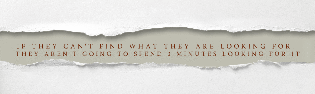
THE REALITY: Life is a hustle these days. We move a million miles a second running our businesses, and honestly, so do your clients and customers. If they cannot find what they are looking for on your site, they aren’t going to spend 3 minutes hunting for it.
THE LESSON: Trying to navigate a sitemap that is laid out like a fever dream is going to feel just like that– following links and threads that lead to nowhere– and undoes your website optimization efforts. You will frustrate your users and when they leave, they aren’t coming back nor are they suggesting your site as the one to go to.
THE FIX: Look at your site’s navigation.
- Is the main top-end navigation easy to find?
- Is it organized in topics with drop down links filling in as more detailed information of the overall navigation link it is placed under?
- Are there any “loose ends” or ones that could be placed in a more intuitive space of related topics?
CHECK YOURSELF: Is your site edible (E-E-A-T Principle)?
THE CONCEPT: Google’s bots aren’t just looking for relevant answers; they are looking for credible sources. You need to prove you are safe to eat, or you won’t be presented as a suitable source of the sustenance sought after.
THE REALITY: That identity— those credentials of Expertise, Experience, Authority, and Trustworthiness (E-A-T)— is exactly what the crawler bots are looking for when they vet your content. If you’re a medical expert, you should be seen as an authority by other credible representatives in your industry. This is done by creating the kind of supportive, optimized content on your site that backs the type of professional you want to be seen as. It may take some effort, but you have already put in the effort to be where you are, you can make sure all that website optimization work you’ve done reflects that.
THE LESSON: This is why simply having keywords isn’t enough. You must actively build a content base (like blog writing with SEO copywriting in mind, or creating a portfolio with all those lovely meta tags working in the background for you). This displays your expertise and invites recognition. If the bots can’t find proof that others trust you, they won’t put you on Page 1.
THE FIX: Audit your site for proof points.
- Do you link out to credible, high-authority sources when citing data?
- Do you showcase testimonials, certifications, or media mentions?
- Are your contact and “About” pages clear?
These external signals prove your authority and let the crawler bots know you are ready to “E-E-A-T”.
Jacob chimes in: “This is one of the most overlooked concepts we see on sites we work on. Your authority score and “EAT-ability” definitely takes time and engagement to build, but little practices are going to help tremendously along the way. Easy rules for outbound linking (your “in-text” citations) is to link to “.edu,” “.gov,” or well-known brands, and shoot for 3-7 links for a standard blog.”
Design
We’ve checked the engine (SEO) and felt the soul (Copy). Now, we check the experience.
This is usually where the battle begins. The Artist wants it to look “vibey” and unique; the Strategist wants it to be functional and fast.
But here is the secret: Design is not decoration. Design is the uniform your business wears.
If your site is beautiful but impossible to read, you lose trust. If it’s functional but looks like a Frankenstein of ten different templates, you lose authority.
Jacob and I sat down to fuse our standards into one final website optimization checklist for the web design side of the trek.
We aren’t just looking for “pretty.” We are looking for usability.
Let’s check your visual gear.
CHECK YOURSELF: Is your visual identity doing a job,
or just catching a vibe?
THE CONCEPT: Your visual identity— your colors, fonts, and styling— is the uniform your business wears. It signals who you are before a single word is read. In the wild, a bright orange vest signals “Safety,” while camouflage signals “Stealth.” Your brand kit works the same way; it is a tool for communication, not just decoration.
THE REALITY: When we build our own sites, we often fall into the trap of picking colors simply because we like them, or choosing a script font because it feels fancy. But design without intention creates friction. If your vibey color palette has low contrast, or your unique font is hard to read, you are actively putting obstacles in your customer’s path.
THE LESSON: Design with website optimization in mind must also serve the user, not just the artist.
Color Psychology: Colors trigger instinct. (e.g., Blue signals trust/calm, Red signals urgency/passion, etc). If you use a jarring neon palette for a therapy site, you are fighting your own message.
Readability: If a user has to squint to read your body text because the font is too loopy or the grey text is too light against a white background, they aren’t immersed— they are annoyed.
Accessibility: This is non-negotiable. Low contrast doesn’t just look bad; it physically locks out users with visual impairments. If your map is unreadable to 15% of the population, you are losing 15% of your potential hikers.
THE FIX: Audit your Brand Kit with a focus on function.
- The Squint Test: Step back. Can you read your main message without straining?
- The Two-Font Rule: Limit yourself to two typefaces. Use one stylized font for Headers (H1/H2) to show personality, and one clean, highly readable Sans Serif font for body text.
- Check Your Contrast: Don’t guess. Use a free tool like the WebAIM Contrast Checker to ensure your text colors are accessible against your background. Make sure your “Vibe” isn’t costing you visibility.
CHECK YOURSELF: Is your design consistent and unified across your site?
THE CONCEPT: Imagine hiking a trail marked with blue blazes, and suddenly they switch to red squares. You stop. You panic. You wonder, “Am I still on the right path?” Design unification is your trail marker system; it tells the user they are safe within your ecosystem.
THE REALITY: We often build Homepages with 100% energy put into our website optimization endeavors, from the SEO copywriting through to the painted display of our design, but by the time we get to the “Contact” page, decision fatigue sets in. We rush the design or grab a different template. The result is digital whiplash, where Page A looks like a modern studio and Page B looks like a blog from 2010.
THE LESSON: Inconsistency breeds distrust. If your visual language (buttons, spacing, headers) shifts halfway through the journey, the user subconsciously thinks they have clicked a broken link. Once that trust is cracked, the user rarely keeps hiking.
THE FIX: Stop reinventing the wheel on every page.
- Use Global Styles: Set your fonts and colors once in your site settings and never override them manually.
- Reuse Layouts: Repetition isn’t boring; it’s reassuring. If a header looks one way on the Home page, match it on the Services page.
- The Rapid Click Test: Click through your main tabs quickly. If one page feels like it belongs to a different business, map it back to the group.
Jacob chimes in: “This right here, unification is one of the single most important habits to instill in yourself. Consistency builds your brand, your persona, and recognition. It also makes you feel more trustworthy and reliable to your audience.”
CHECK YOURSELF: Do your pages have visual hierarchy?
THE CONCEPT: The visual hierarchy of a page has to do with how it’s laid out for website optimization. Unlike what you might have done for your school papers or PowerPoints, centering all of your text and adding some pictures doesn’t do much for your readers.
THE REALITY: Just like with your copywriting, your layout should tell your readers what’s most important and what each section is going to be about.
THE LESSON: When done right, a visual hierarchy won’t be noticed directly, but people will understand your page because you are using the patterns our brains naturally follow to guide your viewer.
THE FIX: High-quality, strategic website optimization uses natural scanning patterns in your layout, so sections line up in formations that look like an F or Z-pattern. This means the line-up focal points are set so that scanning moves left to right followed by a visual break (mimicking the letter F), or focal points alternate from the right side to the left side as you move down the page (mimicking the letter Z).
Also, use your copy hierarchy to guide your visual hierarchy. Use larger, bolder fonts for your H1 than your H2s, H2s are bigger than your H3s, and so on. Create an increased sense of importance on your main section topics and naturally draw the eye to your headings.
Atlas chimes in: “Design truly is where tech meets art. A lot of folks shift between the heading “weights” (H1, H2, and so on) simply because of the size and style associated with them. It often lost that these distinctions act as an actual map to guide, not just users, but the crawler bots that are indexing and taking stock of your content to ensure it flows intuitively. Jacob mentioned the page hierarchy earlier. I mentioned the importance of navigation. This is where it all comes together.”
CHECK YOURSELF: Is your site clean or cluttered?
THE CONCEPT: You want to show your creative skills all over your site, right? Put in those funky dividers, use all kinds of shapes for your text boxes and image frames, add in wild dividers, and fill up every inch of the screen… Get weird with it!
THE REALITY: Well, maybe not. Getting too creative can actually be disorienting for your viewers, and will take away from the user’s ability to scan for visual hierarchy and can negatively impact your overall website optimization. This also works in opposition to the idea of unifying across your site.
THE LESSON: A clean page doesn’t mean boring. It guides your users, and makes the important parts really stand out.
THE FIX: Stick to your brand kit colors and fonts, and stay consistent with your shapes, dividers, and all of your globals. Make sure to leave some room between items and sections on the page to breathe (but that doesn’t mean have a bunch of dead space, either).
Ultimately, cleaning up your page is the culmination of everything in this website optimization checklist, with the goal of making your UX/UI as refined and understandable as possible.
Remember: always make it scannable!
YOUR EXPEDITION BEGINS NOW.
Okay, take a breath. We just covered a lot of ground.
If your head is spinning a little, that’s normal. I definitely have had to twist my head around to look straight at some of the sites I’ve built in the past, or ones I’m brought in to optimize.
Looking under the hood of your own business— really looking at the broken links, the fractured copy, or the messy design— can feel heavy. It’s easier to just look away and hope the “Q4 Boogeyman” doesn’t catch up.
But here is the good news: You aren’t flying blind anymore.
You’ve got a map. You know where the leaks are in your tent. You know which trail markers are missing.
The difference between a frantic, reactive 2026 and a strategic, peaceful ascent isn’t luck; it’s preparation.
So, what’s your next move?
You have two paths up the mountain:
- The Solo Climb: Take this checklist, block out a weekend, and start patching the website optimization leaks yourself. You have the tools, and you now have the standards. Holler if you want the PDF version of this checklist!
- Call the Support Crew: If you found a website optimization leak you don’t know how to fix, or if you’d rather focus on the climb than the map-making, we are here. Send us a message here or at atlas@remappedsolutions.com and lets start mapping your course.
At Re:Mapped Solutions, our job is to carry the heavy gear and chart the course so you can focus on the mission.
We carry the map so you can enjoy the view.
Ready to stop guessing and start mapping?